
Opportunity
Collecting physical stamps has long been a familiar and highly engaging behaviour for shoppers across various grocery banners in Hong Kong, so much so that it even fuelled secondary resell markets for full stamp sets. Recognising this, Yuu successfully digitised the experience through eStamps, driving significant improvements in transaction frequency and user engagement.
Building on that success, we saw an opportunity to further expand the progress-tracking dynamics and introduce more gamification into the loyalty experience, moving beyond transactions to reward a wider range of user behaviours and deepen emotional engagement with the Yuu platform.
What we are improving
With infrastructure already in place and clear user affinity for progress-driven experiences, we set out to create a new way to track and reward users for repeating desired actions, whether online or offline.
These actions could range from store visits to app interactions and would help:
Incentivise more frequent and habitual behavior
Offer recognition beyond transactional loyalty
Create deeper member investment and brand affinity
Objectives
Expand Active User Base: Grow the active user base by transitioning from a passive loyalty model to an interactive, challenge-driven ecosystem.
Drive Incremental Sales: Grow sales for banners and e-commerce channels by implementing an achievement and reward loop to incentivise repeat transactions and habitual spending.
Accelerate Points Usage: Boost the points earn and burn rate by more closely linking redemption and accumulation to visible, achievable progress goals.
Deepen Loyalty Penetration: Increase loyalty programme engagement by improving the perceived and stored value of user efforts through progress tracking and achievement recognition.
Process
Building the Foundation
Before we could design the front-end experience, we needed robust backend support. We developed a dedicated microservice to log, store, and retrieve individual user progress. This service was architected with scalability in mind, allowing it to support different types of challenges and usage patterns in the future.
This decision allowed product and marketing teams to create diverse, behaviour-based offers without requiring new development each time.
Process
Defining the Mechanics
With the technical foundation in place, three core types of challenges emerged, based on a mix of behavioural patterns and business incentives:
Action Counter:
Track repeated actions (e.g., visit 7-Eleven 5 times)
Numeric Counter:
Track cumulative metrics (e.g., spend $500 at Wellcome)
One-off Action:
Track one-time milestones (e.g., redeem 3 rewards in one month)
In response to feedback and future campaign plans, we also built support for repeatable challenges and autostart.
Repeatable challenges - challenges that restart after completion. This meant a single challenge could have multiple reward cycles attached.
Autostart - users could begin accumulating progress passively. To ensure users were aware of this feature, users could only receive credit for their activity only after they engaged with the challenge feature, effectively nudging them to revisit the dashboard, discover other challenges, and reinforce a habit of checking back regularly.

Challenges needed to reflect retroactive progress while prompting users to claim it in order to receive credit.

Each reward instance had to be surfaced clearly to avoid confusion.
Technical limitations meant that we also had to signpost 'In Progress' challenges that don't have the most up to date status.

The challenge card itself had to communicate that it was ongoing, with multiple reward cycles attached.
In defining the challenge mechanics, we also had to account for the various states a challenge could exist in, which introduced additional complexity to both the logic and the interface.
For completed challenges, rewards varied in type—some granted Yuu Points instantly, while others unlocked digital rewards such as e-vouchers or coupons redeemable in-store. For the latter, we opted to use QR codes for redemption, which meant designing a distinct “completed” state with QR visibility and expiry details, alongside a separate version for auto-credited points.
On the in-progress side, we identified at least five distinct states that required clear differentiation.
Each of these states had implications for copywriting, iconography, button logic, and visual cues. It was important that users understood not just what stage they were at, but what actions, if any, were required next. Designing for these nuanced states ensured transparency, minimised user confusion, and helped reinforce a sense of control and reward throughout the challenge experience.

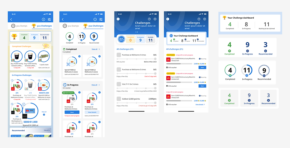
Design
Showing Progress
We also explored several ways to visually represent progress within challenges. Initial concepts included linear progress bars and stepper-style indicators, which offered clear visibility but felt visually disconnected from the rest of the app.
After testing various layouts, we ultimately opted for a circular progress indicator, a component already used in our existing Stamps feature. This choice not only ensured visual consistency across the experience but also leveraged established user familiarity, reducing the learning curve.
The circular format also fit neatly within a rectangular card tile, mirroring the visual structure of our offer and reward listings. Beyond consistency, the rectangular tile format evoked a badge or collectible card aesthetic, reinforcing the gamified feel of the experience and tapping into well-known reward mechanics. This approach allowed us to present progress in a playful yet structured way, while maintaining a cohesive interface across the app.

Design
Rethinking the Layout
As we introduced challenges into the app, we needed a clear and engaging way for users to view, manage, and return to their challenges. Our early design explorations focused on a central dashboard layout that summarised challenge activity, such as the number of in-progress, completed, or available challenges.
While this offered a broad overview, it quickly became visually dense and harder to scan, especially as the number of active challenges grew. To improve usability and create a more focused experience, we pivoted to a tabbed layout, allowing users to toggle between three key views:
Recommended:
Challenges that are new, personalised, or time-sensitive
In Progress:
Challenges that the user has already started or triggered
Completed:
Finished challenges with rewards already earned or claimed
This decision provided several UX advantages:
Reduced cognitive load
Users didn’t need to parse mixed content types in a single list, making it easier to navigate and prioritise.
Improved scannability
Clear separation of challenge states helped users immediately orient themselves and understand what required attention.
Stronger engagement cues
The Recommended tab acted as a discovery layer, prompting users to explore challenges they might not have otherwise seen
In addition, we also went with a tabbed structure, which allowed us to introduce filtering and sorting capabilities, an essential feature for our user base. As many of our users are banner-loyal, meaning they consistently shop with their preferred retail brands (e.g. 7-Eleven, Wellcome), we wanted to make it easy for them to find challenges that matched their habits.
By enabling users to filter by store, category, or challenge type, we not only helped them feel more in control, but also reinforced the sense that they were being rewarded for their loyalty. This added a layer of personal relevance to the experience, increasing the likelihood of challenge activation and repeated engagement.
Solution
These design decisions weren’t just about covering edge cases, they were strategic levers to drive engagement. Autostart ensured low-friction entry, while ‘claim progress’ checkpoints created moments of user awareness and delight. Repeatable challenges extended the lifespan of each interaction, allowing a single behaviour to generate recurring value for both the user and the business.
These features helped transform the challenge system into a sustainable and engaging experience loop designed to reward users for everyday behaviours while nudging them towards deeper interaction with the app.
Our most successful challenge, offering a cash coupon reward, drove
HKD $10 million in incremental spending—representing a 71.43% lift between the pre-promotion and promotion period.
The challenge feature saw 2.5x more traffic in second month of launch than any other features and for the following 3 month period saw 1.5x more traffic than ay other service.
Targeted redemption challenge reduced customer acquisition costs (CAC) for new redeemers by 31%.
Final Design

