My Role
Product Designer
Responsibilities
UX/UI Design
Team
Project Manager
Product Owner
Lead Software Engineer
TLDR;
SOLUTION
An app revamp and overhaul
Redesigned the app's information architecture to streamline core user journeys
Defined clear objectives for existing and new features including gamification elements to incentivise repeat usage
Restructured content to surface most relevant calls-to-action while meeting varied business, stakeholder and partnership requirements
OBSTACLES
Navigating shifting team structures:
Ongoing restructures and organisational changes required constant realignment across teams
Balancing diverse stakeholder priorities: With input from numerous departments and partners, aligning on a unified content strategy proved challenging, often requiring negotiation and compromise
Tight timelines and shrinking budgets: Time limitations and progressive budget reductions required us to adapt our scope, simplifying flows and interface components while still preserving core functionality and user value
KEY TAKEAWAYS
Content we designed for today will change for tomorrow... While our goal was to build with flexibility in mind, we learned that strong content strategy is a prerequisite for good UX. Although the design accounted for content variability, the business’s ability to continuously produce content was a key dependency. In hindsight, modularity alone wasn’t enough—dynamic content sets may be a more effective solution next time
Clarity over perfection...with numerous variables and moving parts, aiming for 'perfect' can be an unrealistic goal, focusing on clarity and consistency was a more effective strategy
Background
Rolling Stone’s existing mobile app was designed before Penske Media Corporation took over the brand. Not only did we want to create an app to look and feel as if it belonged under the PMC umbrella, it needed to mirror the rebrand that Rolling Stone went through two years ago and create an app that reflected how our users consume content and allow them to easily navigate our content-heavy platform.
To make sure our current project scope would answer existing problems, we made sure to do a content audit of the existing app to understand our goals.
Key Opportunities
User needs
Design for everyday flow
Create a better user experience, fast loading articles, offline use, easy navigation
Future-proof for scale
Create opportunities to connect and increase engagement rates
To create a mobile app that includes full digital editorial content and ability for subscribers to read the magazine on their phones to help service the 20 million views per month.
Business needs
Fair visibility for all
Create monetization opportunities - advertising opportunities and paid subscriber
Meet customers where they are
Design the app to look and feel on brand with RS new logo and brand colors
Research
Current flow
Determining priorities
To understand how our business and consumer goals could align, we did a content audit of the existing app and market research to come up with our product roadmap.
1. Content Audit of the Existing App
Failed poorly in experience, branding and discovery, users weren’t able to find or search for content (broken feature)
Lack of filters, labelling and categorization (explore)
Content was presented purely by visuals and provided little to no information
No updates for years, outdated design and experience
2. Market Research
Market research indicated that mobile app users are projected to grow to 258 billion by 2022 from 205 billion in 2019 with the highest percentage of users in the 18 - 34 age bracket, Rolling Stone’s key users.
66%
of digital media time by 18-24 year olds are spent on apps
54%
of digital media time by 25-34 year olds are spent on apps
We also looked at in-house analytics, currently, 80% of RS traffic comes from mobile, from both repeat users and unique visitors. By looking at our readers and the key figures, we knew that creating a premium mobile app that could service all our readers including magazine subscribers, would be vital to their reading experience.
Research indicated that a native app, could help RS serve a loyal and familiar audience and provide easy navigation designed for a thumb.
The Journey
So how were we going to serve our audience and reach our goals? We needed to understand our user’s decision making points, not only would this help us create a seamless journey but it could help us determine what features and business opportunities we can include in our product to reach our goals. This would help us break up the product into sections for different services and to help provide an idea of what the interface will look like.

After defining our user flow, we were able to clearly map out areas where we could reach our consumer goals. Features include:
Immersive, Multi-Format Reading Experiences
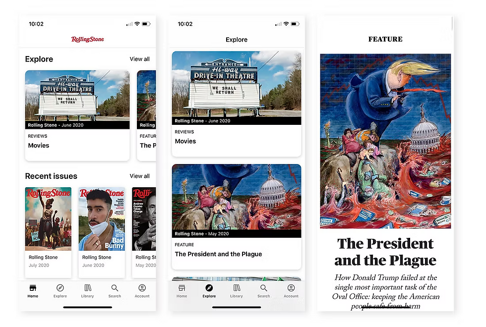
The app supports Rolling Stone’s editorial depth with reviews, long reads, photo galleries, videos, shoppable stories, and curated lists. This range lets users choose how they want to engage, whether scrolling quick lists or diving into in-depth features, while keeping navigation seamless across formats.
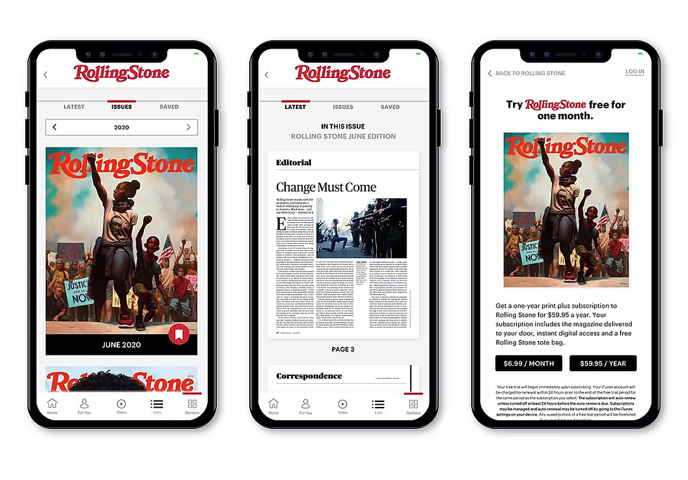
Exclusive Digital Magazine Hub for Subscribers
We built a dedicated magazine section for subscribers, replicating the print experience while optimising for mobile reading. This exclusive space reinforces subscription value and makes premium content easier to find, browse, and enjoy on the go.
Personalisation and Timely Engagement Features
Users can follow favourite artists, genres, and topics to tailor their feed. Interest-based push notifications highlight breaking news, fresh reviews, and upcoming events, driving repeat visits without overwhelming the reader.
Integrated Marketing and Brand Growth Opportunities
Flexible layouts showcase promotional spots for new content, tours, and branded events. Native ad formats and sponsored content integrate seamlessly, balancing monetisation with a premium reading experience.
Design Approach
Using a Modular System
For a content-heavy app like Rolling Stone’s, flexibility and consistency were paramount. We adopted a modular system, creating four distinct card types for headlines, videos, and carousel features.
By standardising image ratios to 16:9 and 4:3, we ensured visual harmony across the app and avoided image distortion, which was critical for maintaining a polished, professional look on small screens.
Intuitive Navigation Design
With our modular system established, we prioritised navigation to help users effortlessly find what they seek. We placed a horizontal scroll menu at the top, supplemented by breadcrumbs and filters, offering users a snapshot view of categories.
A sticky footer provided quick access to key actions, creating a browsing experience that feels natural, consistent, and comfortable—even amid vast content.
Meeting Our Core Goals
To recap, we had a total of four consumer and business goals. How did we meet them?
Creating new revenue streams with dedicated ad spaces and subscription banners
Encouraging content recirculation by suggesting related galleries or articles
Boosting engagement through personalisation and social features
Reinforcing brand identity across all touchpoints
Solution
Now that we had our wireframes, it was time to add RS’ visual identity to it. First, we integrated Rolling Stone’s refreshed visual identity seamlessly, beginning with the modernised logo prominently placed front and centre. To maintain brand consistency, we referenced the website’s colour palette—red, black, grey, with yellow highlights—ensuring a bold yet cohesive look across the app’s interface.
Now that we had our visual elements in place, we can deep dive into the key features of the app to meet our four goals.
1. Curation
With our modular system established, we prioritised navigation to help users effortlessly find what they seek. We placed a horizontal scroll menu at the top, supplemented by breadcrumbs and filters, offering users a snapshot view of categories.
A sticky footer provided quick access to key actions, creating a browsing experience that feels natural, consistent, and comfortable—even amid vast content.
This approach reduces cognitive load, keeps users focused on what matters to them, and increases daily return visits.
Why it matters

2. Navigation
In a brand with dozens of daily uploads, navigation had to be intuitive yet uncluttered. We implemented a sticky navigation bar at the top, with a clearly marked underline to signal the user’s current location. On certain screens, a secondary navigation bar appeared below, visually differentiated to prevent confusion while indicating its relation to the main navigation.
We also introduced quick actions in a brightly highlighted footer for essential features. This three-tiered navigation system—primary, secondary, and footer—enabled quick content discovery, boosted recirculation, and increased opportunities for internal story promotion.
Clear, layered navigation empowers users to explore more content with minimal friction, improving both engagement and session duration.
Why it matters

3. Socialisation and Reasons to Revisit
Discovery is valuable, but the ability to revisit content is essential for ongoing engagement. We added a bookmarking feature, allowing users to save articles for later reading. Social sharing tools were also integrated, encouraging users to share favourite or relevant stories with their networks, extending the app’s reach organically.
To ensure maximum immersion, article views were designed without the sticky footer. This gave full screen space to the story content and allowed rich imagery, especially in gallery mode, to shine without distraction.
This approach reduces cognitive load, keeps users focused on what matters to them, and increases daily return visits.
Why it matters

4. Bridging Offline and Online Experiences
As the magazine is central to Rolling Stone’s identity, we integrated an in-app e-reader for print-specific content. Users could also download and store back issues, making favourite editions accessible anywhere without the need for physical copies.
Merging the tactile nostalgia of print with the convenience of digital strengthens brand loyalty and adds tangible value for subscribers.
Why it matters