Opportunity
Our goal was to enhance the app's main customer journey. We did this by focusing on how most users search for banner-based content, giving them more control through clear layouts, filtering, and sorting. This approach also provided a fair and visible platform for our strategic partners.
What we are solving
-
Unclear Information: Currently, information isn't clearly sectioned, making it hard to find and had no distinct functionality from other areas in the app.
-
Limited Value: The existing page lacks detailed and dynamic information, there was no value add for users visiting this page.
-
Loyalty Scheme Confusion: Users struggle to understand each brand's loyalty scheme (e.g., earn-only vs. earn and redeem).
-
Poor Content Discovery: Content is hard to find and discover, with too much reliance on the homepage feed.
Objectives
-
Boost Sales: Drive more sales for banners and e-commerce, help users easily find relevant offers, whether they're planning ahead or shopping in-store, to encourage repeat or larger transactions.
-
Increase Transaction Value: Encourage repeat and higher-value transactions. Increase user awareness of promotions and related products as they explore offers, helping to drive larger baskets through timely and relevant discovery.
-
Promote Points Usage: Boost points earn and burn behaviour, making accumulation and redemption more habitual and engaging for users.
-
Deepen Loyalty: Increase loyalty programme engagement by improving the quality of banner pages, making them easier to navigate and use as central hubs for discovery.
Process
Benchmarking
We kicked things off by diving into benchmark references. This meant looking at how other loyalty and e-commerce platforms show partner or category content. This really helped us pinpoint the best ways to use modularity, categorisation, and engagement tactics.

Process
Considerations
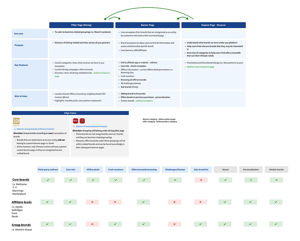
Next, we clarified the primary purpose, use case, and key features required for our banner pages. To get a deeper understanding, we worked closely with the partnerships team and explored all the different tiers and mechanics of our partner programmes, which was crucial for spotting edge cases. For instance, we identified special VIP offers for Wellcome or ongoing, 'always-on' cross-banner promotions.
We discovered there were four key types of partnership schemes that we needed to consider as each one had its own unique content and calls to action.
Core brands
Brands under the DFI parent company umbrella, and have the most robust amount of news, promotions and types of offers and rewards.
Afiiliate brands
Brands under fashion and travel categories, and only have earn functionalities
Group brands
Brands that belong under a larger umbrella organistaion and have cross-functional offers and rewards schemes
Strategic partners
Brands like Hang Seng and insurance, who have content and offer mechanisms unique to their business

We then did a thorough audit of current offers and rewards, double-checking with our marketing and partnerships teams to group them logically. This helped us sort the content into core types, making it easier for users to understand how different offers and rewards worked based on the brand category – like insurance versus fashion.

Solution
We designed a modular and scalable banner page. This means it can adapt to the unique needs of different partners while keeping a consistent look and feel across the platform.

Thanks to our modular design, each banner can show different types and amounts of content without breaking layout or usability.
Personalised Content Blocks
We added background colours and icons to help users quickly tell the difference between content types, like limited-time promotions or charity offers.
Visual Differentiation
For insurance and banking brands, we made the Browse experience richer. For example, users can now filter by coverage type or see earning rules with pending periods.
Rich Product Highlighting
We introduced smart redirections to encourage users to keep exploring. This includes links to similar brands, category tags, and redirects to reward hubs.
Navigation and Ecosystem Integration
We made sure there were clear labels and sections explaining how users could earn and redeem, where the offer applied (online/offline), and what role the brand played within the wider Yuu ecosystem.
User-Centric Information
Wireframes

Final Design
