Opportunity
With increasing demand for telehealth services post‑pandemic, Vhi needed to evolve its Online Doctor experience. The existing journey was disjointed where users were redirected to a third-party platform, causing confusion, long waits, and low visibility into the consultation process. There was a clear opportunity to embed the service natively into the Vhi app, simplify booking, and improve user confidence when accessing virtual care.
What we are solving
-
Clunky, inconsistent booking: Users were being redirected to an external platform, breaking the flow.
-
Lack of clarity: Patients struggled to find information about what to expect from consultations.
-
Unclear Process for Dependents: Parents and guardians often experienced uncertainty when booking consultations on behalf of their children. They were unsure whether to use their own account details or create a separate profile, leading to booking delays.
-
Rigid editing: Inability to correct or add additional details without restarting the process.
Objectives
-
Enhance Booking Success Rates: Optimise the booking journey to ensure users can complete appointments quickly and accurately, boosting overall completion metrics.
-
Improve Operational Efficiency: Address frequent booking-related queries through in-app guidance and prompts that capture essential information, freeing up both customer service and medical staff to prepare effectively.
-
Foster User Confidence: Enable users to clearly input all relevant details when booking, giving doctors accurate, context-rich information in advance. This transparency reassures users their needs will be understood and helps prevent miscommunication—improving both trust and care outcomes.
Process
Discovery
To understand the core issues users face when booking telehealth appointments, we began with a qualitative discovery phase. We conducted open-ended interviews with a diverse demographic spanning ages 18–64, ensuring we captured a range of user needs, expectations, and levels of digital fluency.
We spoke to five participants, asking broad yet targeted questions about their current booking experiences, frustrations, and ideal features. From this, several recurring themes emerged
Input comrephensive details
-
relevant medical history
-
contextual information
-
current symtpoms
Summary of submissions
-
to confirm accuracy
-
maintain complete medical history
-
share with GP
Book for dependents
-
seamless dependent booking process
These insights formed the foundation for our persona mapping, where we identified three distinct user types. Each required a tailored journey that still aligned with a single, cohesive booking framework—ensuring all objectives could be met without increasing complexity.
Process
User Types


Process
Design Exploration
Mapping the Journey
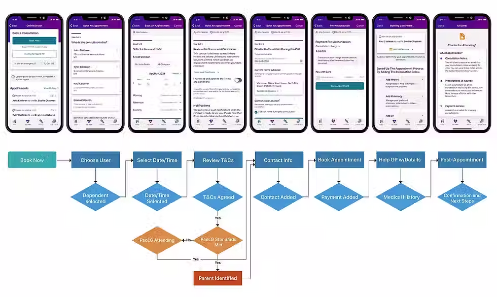
We listed out the primary touchpoints needed to create this booking experience and broke it into 6 steps to ensure it felt manageable and logical:
1.
Choose who the appointment is for
2.
Choose a time and date
3.
Review and agree to T&Cs
4.
Input medical information
5.
Input contact/payment details
6.
Complete booking
.avif)
Process
User Testing
Validating the Flow
Following journey mapping, we moved into task-based usability testing to evaluate our proposed 6-step booking flow. We recruited seven participants, representative of our target audience, and asked them to complete realistic tasks within a clickable prototype.
Key tasks include:
Locating notes from a previous appointment
Booking another time slot
Adding personal medical details and pharmacy information
The results were encouraging, all participants completed the tasks successfully when following the direct journey, confirming that the flow was intuitive and logically structured. However, we uncovered one area for improvement:
A small number of users missed the opportunity to add photos and pharmacy detail inadvertently closing the journey before completing this step. This indicated that our prompts for optional uploads needed stronger visibility and clearer timing within the flow.
Photo and Pharmacy Input Drop-Off
While no usability blockers were reported, this finding informed our decision to optimise the placement and signposting of the photo upload step to ensure higher conversion without adding friction.
Scenarios, Challenges and Decision-Making

Date Picker:
What
Designed to help users feel “unstuck” when appointments are unavailable — showing other available slots and clinicians.
Constraint
Edge case scenario where users may be in a different time zone
Solution
Month format to change from 5-day week view to become a 6-day week view

Additional Medical Info
What
We designed 2 different flows to encourage optional uploads by incorporating them within Step 4, after Step 5
Constraint
Booking API didn't allow us to use either flow.
Solution
Add after payment but use UI and copy to encourage users to add additional information.
Solution
Outcome
As lead designer, I championed a solution that prioritised user clarity and flexibility, while respecting backend and compliance constraints. Key decisions included:
Fully embedded booking flow
Eliminated third-party redirects and created a native in-app experience with clear progress steps and editable fields.
Appointment history and document access
Introduced a single source of truth for consultation records, giving users full transparency over their health data.
Reusable Design System
We built the Online Doctor flow as a design framework to scale across Vhi’s broader telehealth offerings including Online Physio, Speech & Language Therapy, and Dietitian services, providing visual and interactional consistency across products.